Back to Projects

QUA– Travel Planning Application

Product Research / Web & Mobile / Brand & Visual Design
Project Overview
A travel planning application that accommodates for factors beyond our control and help people add a little more spontaneity in their newest adventures.
Timeline - Fall 2022, 16 Weeks
Tools - Figma
Research Team - Yifei Chen, Teresa Yang, Jessica Lai, Stephen Tao
Design Team - Jessica Lai, Anthony Pan, Olivia Luk, Gretchen Kupferschmid
An algorithm that can generate suggestions based on your current emotions and interests.
A modular framework that was created for a flexible schedule that has a clear organization of plans.
Problem Space
Trip planning can be a stressful and arduous process, and even with the most experienced in planners, unforeseen circumstances may still arise. As risk-taking and spontaneity are a natural part of the travel process, we asked the questions:
Research Methods
We conducted research through a variety of methods, starting with reverse assumptions. This is when we started to recognize the assumption and myth that “people always plan trips”. Following that direction, we used contextual inquiry, speed dating, direct storytelling, empathy maps, affinity diagramming, user journey mapping, and prototyping to further investigate how people felt about spontaneous travel and explore different solutions.
Quotes
During our interviews, we focused on investigating how people view the inevitable and how they problem solve to minimize the cost. This made us realize that the problem space was related to the idea of young adults finding balance between comfort and stepping out of their comfort zone to learn in an unfamiliar environment.
Insights
Goal
avoid over planning, allow users to experience their travel in the moment, and come back with unique stories and experiences.

Target audience
young adults who are open to the idea of adding spontaneity into their travels in a playful matter.

Elements of Consideration
Scale — general to specific location
Time — efficiency and cost of time
Safety — sense of security
Branding
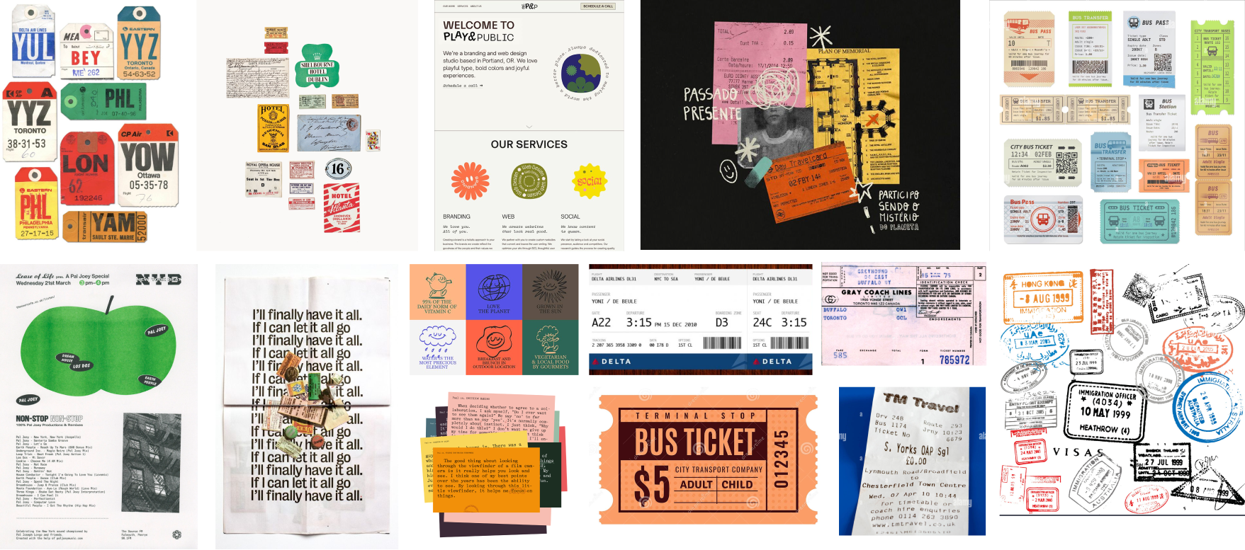
Looking at visual imagery from luggage tags, transportation tickets, stamps, and receipts, we wanted to play with quirky and playful receipt type and heavy weighted san serifs. These colorful elements would be used for the brand website, social media, and merchandise.
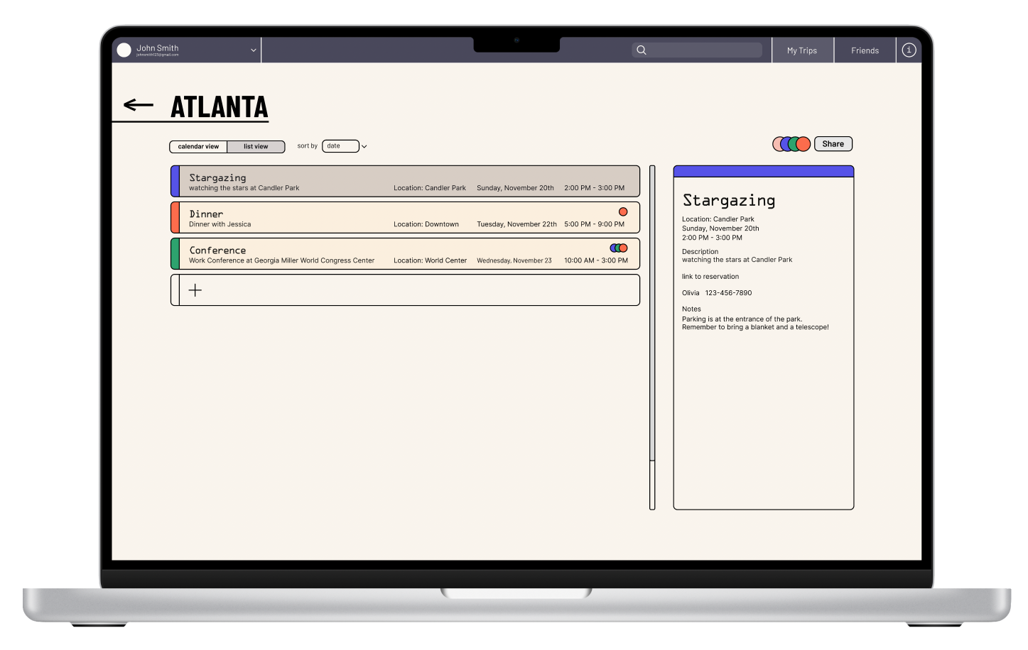
Since the product and brand website being a more colorful and playful with it’s visual design, we needed to make sure the tool itself wasn’t too overpowering in personality, because it can become too complex and distracting to use, which takes away from the functionality. While staying within the same color palette, the actual planning application's UI aims for a more minimal and clean work space with a touch of colorful options customizable to use for organization purposes.
Concept Development
By mapping out our user flow, we were able to identify key touchpoints in the desktop app, which was also implicated in the mobile version.
Reflections
My role within the project was very wholistic as I had the opportunity to combine my research and design team together to execute higher fidelity prototypes based on dedicated research. We also took a unique perspective as a team to find a solution within juxtaposition –– to accept the uncontrollable with spontaneity and fight stress with a planner. We are currently in the process of refiing our mobile prototype as it includes on-the-go features that further present our research findings. So please wait patiently for the newest update!
Back to Projects